YouthCare

(2023)

Duration
3 Months
Role
UX Designer in Team of 5
Project
Our team revamped the website (25+ pages) for YouthCare, the largest non-profit in the PNW helping homeless youth.

Context & Problem Space

YouthCare helps homeless youth in PWC
YouthCare is a Seattle-based nonprofit organization dedicated to ending youth homelessness. For over 50 years, it has provided critical support particularly in education and employment training, empowering youth with the skills they need for a brighter future.
YouthCare faced a challenge with their most valuable stakeholders—donors, volunteers and sponsors—who preferred calling over using the website, despite all necessary information being available online. This added strain to an already understaffed team.

Research & Strategy

Why key stakeholder are not using the website?
We leveraged a mix-method research methodology during the research phase.

Semi-structured interviews (9 users)

Competitive analysis (5 websites)

Focus group (4 participants)
A focus group identified information overload as a key challenge, rooted in the diverse needs of multiple stakeholders—donors, volunteers, beneficiaries (homeless youth), and potential partners. Accommodating all these audiences has led to a chaotic content structure. They can never find the right information at the right time.

This finding prompted a deeper dive into the website’s information architecture, aiming to revamp it and address the key pain point.

Rethinking
Information Architecture

The current information architecture, designed by YouthCare, follows a bottom-up approach—starting with the activities they offer to stakeholders.
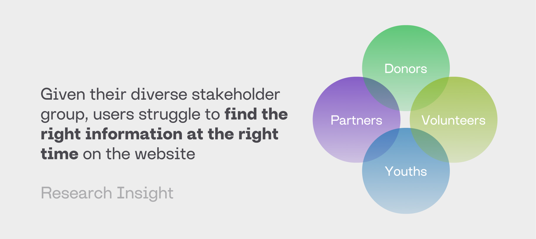
However, the current architecture isn’t effective—most users struggle to find the right information when they need it. Analyzing the core issue through the Satisfaction Model reveals that users lack clear hints or 'information scent' to confidently navigate. This is largely due to YouthCare’s complex services and inconsistent levels of detail across links."
The key to solving this pain point is understanding users' mental models and restructuring the information architecture. This ensures strong 'information scents' that guide users effectively and establish the right mental map for the site.
We conducted 15 card-sorting sessions with users and shifted from a bottom-up to a top-down approach. Guided by personas, we began with key questions: What tasks do users want to accomplish?
The refreshed information architecture resulted in a 30% decrease in time needed for key users to completing their essential tasks, as confirmed by user testing.

Design Solution

Our research revealed that most stakeholders performing key support tasks, such as donating or volunteering, have faced their own struggles or setbacks early in life, fostering empathy for the youth. Therefore, highlighting young people's stories is essential to creating a personal connection and encouraging support behaviors.
Our research insights show that the most important deciding factor for newcomers to perform a support act for the first time is whether they feel they can trust the organization. Trust can be conveyed through consistency, visual design quality, and user experience. To enhance user trust, we redesigned the grid system and revamped the style guide, ensuring a consistent, modern, and approachable look.

Design Outcomes

5/5 Prefer Web Over Calling
All five testing users stated they now prefer using the website over calling YouthCare due to the improved experience and trustworthy image.
60% Time on Tasks
Our design successfully reduced time spent on tasks for primary persona. Increased efficiency finding relevant information on the site.

Work with me

I am open to full-time roles in product design.

Based in Seattle, WA. Open to Relocation!

Hit me up