Studybuddy is a co-studying platform that match users for 1-on-1 online sessions.
Design Preview
Context & Problem Space
Why do Gen Z need study buddies?
Procrastination thrives in solitude—StudyBuddy matches you with a partner so you can stay accountable and focused.
StudyBuddy matches users for 50-minute study sessions, helping them reach their study goals. After joining YC 2024, the platform has grown to 12,000+ users worldwide, building a community of people who support each other in staying focused.
Losing users after first-time user experience
With the launch of the subscription membership model, the high drop-out rate became a crucial gap and presents a major business opportunity: improving the first experience to increase the likelihood of users converting to paying members.
Research & Strategy
Mixed-Method Research
After gathering insights from 15 active users through interviews and surveys,
✦ Semi-structured interviews (15 users)
✦ Competitive analysis (5 products)
✦ Survey (60 responses)
I identified 3 critical moments where first-time users feel overwhelmed. And throughout all the moments, stranger anxiety is the key reason why users drop off.
I arrived at this design question to help my design process. The goal was to help ensure users have a smooth first-time experience.
Design Solution
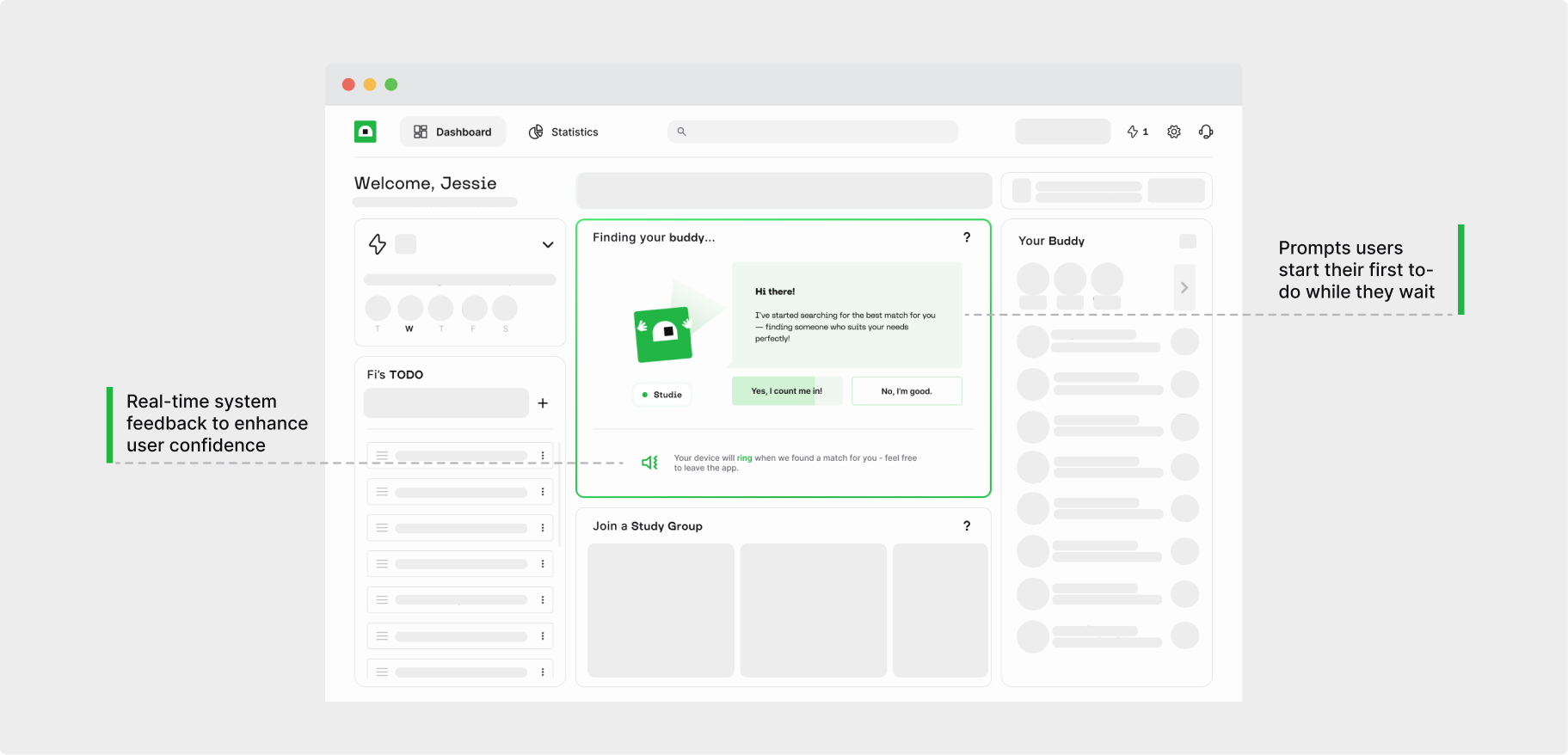
With a low user base on the platform, users are experiencing long wait times for a match. This delay impacts the overall user experience and could lead to frustration or drop-offs.
Adding a facilitator role to ease the stranger anxiety
By introducing an animated character, the platform can guide users to initiate their first to-do while they wait for a match. Meanwhile, live system updates will keep users informed about what's happening on the backend.
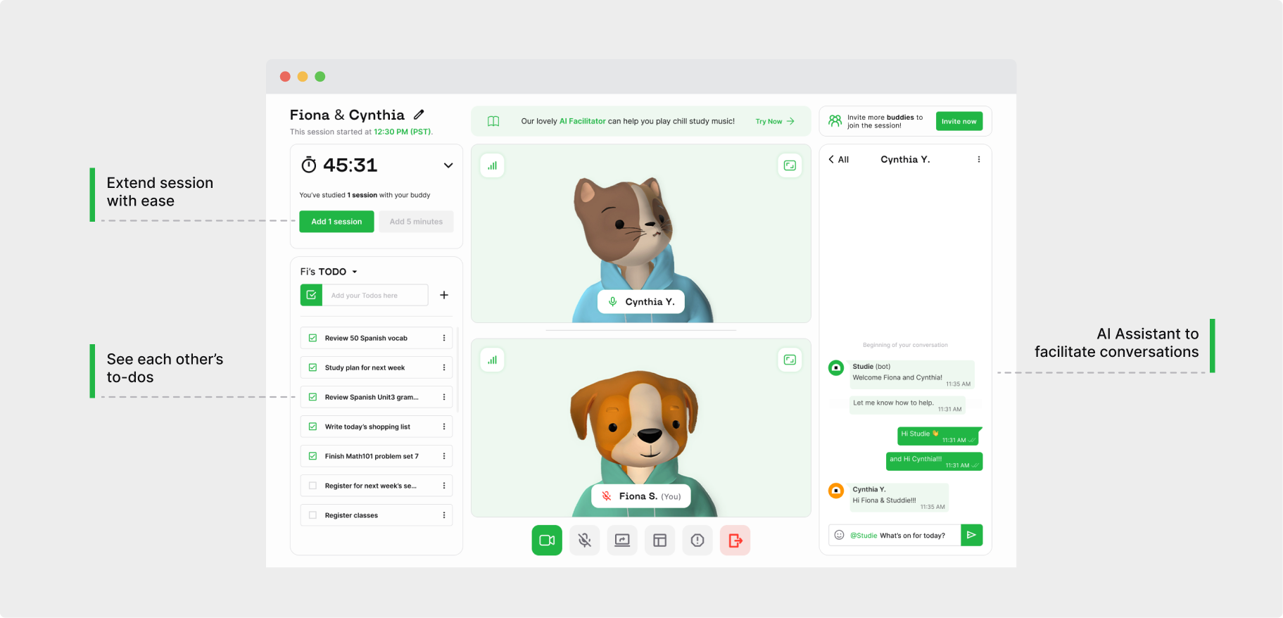
The start and end of sessions can feel awkward, especially with greetings and deciding whether to extend the session. These moments of uncertainty can make users feel uncomfortable and disengaged.
A personalized chat flow can guide users through the ice-breaking process
Introduce light ice-breaker prompts at the start to ease users. After exploring various options, including a toolbox and immersive script-based chat bot, we tested a mid-fidelity prototype and decided on an AI-facilitated chat. This solution requires minimal tech support, reduces distractions, and helps users stay focused on their study session.
In the current design, after the session ends, users are redirected to the homepage without a conclusion or wrap-up message. This leaves them with no opportunity to provide feedback, feel a sense of accomplishment, or set expectations for future sessions, making it highly likely they will drop out after their first experience.
Add a light preference check at the end of each session where the AI facilitator assesses the vibe of the session. This gives users control over their preferences for future matches, helping them feel more confident about improving their experience going forward. It also ensures a positive closure to their first experience, setting expectations for future sessions.
Revamped Onboarding Experience
Bring all the key moments together in a special finale of the onboarding experience—a mock study session with our friendly animated character!
Create a simulator experience for new users to help them get comfortable before joining a real session with a stranger. The practice session will feature a scripted character as their mock partner.
Design Outcomes
70% Drop-off
After implementing onboarding tutorial flow and partially implementing the meeting view design, drop-off rate decreased 70%.
120% SUS Score
In a usability test with 5 users, the SUS usability score of the system improved by 120%, leading to a better user experience.